Dark/Light Website Theming With CSS Variables
Nitin Suresh Hepat
8 Jun 2020
•
6 min read
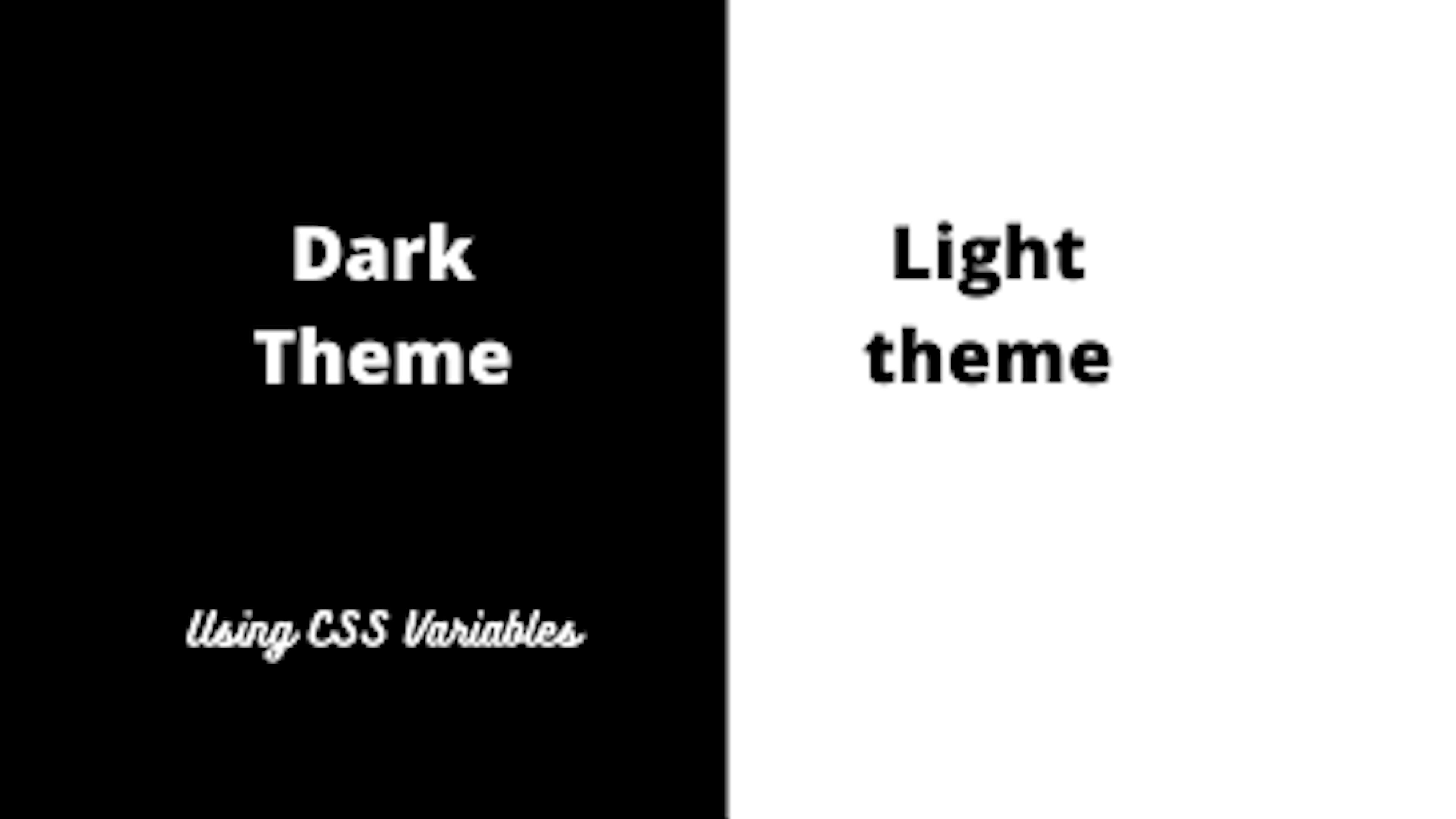
Nowadays, while developing a website or web application, you need to take care of the theming of the website. You need to think about how easily theming can be manageable with minimum CSS.
So, for your help, we have CSS variables. CSS variables are custom properties, which can be defined once and reused several time
body {
  --main-color: black;
}
In above example we defined --main-color as a custom variable which can be used anywhere
like below
.container {
  background-color: var(--main-color)
}
Note: CSS variables should be defined at the global level to use inside child elements and for more info please go through this post
We will be building day and night mode theme switcher application using CSS variables and vanilla javascript
If you want to access code you can check out github repository and also see demo live
Let’s get started!
Creating a 'theme.css' file
Always remember theming CSS should not be mixed with other CSS, so keep it separately
body {
    margin: 0;
    padding: 0;
}

.dark {
    --bgColor:# 161625;
    --color: white;
    --headerBg:# 161625;
}

.light {
    --bgColor: white;
    --color: black;
    --headerBg:# E8E8E8;
}
We have created a simple configuration for dark theme and light theme where we defined background color, font color, and header background.
We have created a basic application where we just changing the color scheme for header, body background, and font color.
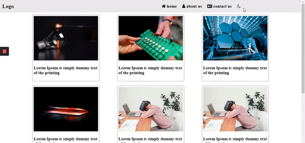
Creating A User Interface
HTML file
<!DOCTYPE html>

<head>
    <link rel="stylesheet" href="./theme.css" />
    <link rel="stylesheet" href="./style.css" />
    <link href="https://stackpath.bootstrapcdn.com/font-awesome/4.7.0/css/font-awesome.min.css" rel="stylesheet" integrity="sha384-wvfXpqpZZVQGK6TAh5PVlGOfQNHSoD2xbE+QkPxCAFlNEevoEH3Sl0sibVcOQVnN" crossorigin="anonymous">

</head>

<body id="body-container" class="light">
    <header>
        <nav class="header-container">
            <div class="logo-section">
                <span class="logo">Logo</span>
            </div>
            <nav class="menu-section">
                <ul class="header">

                    <li>
                        <i class="fa fa-home" aria-hidden="true"></i>
                        home
                    </li>
                    <li>
                        <i class="fa fa-user" aria-hidden="true"></i>
                        about us
                    </li>
                    <li>
                        <i class="fa fa-id-card"></i>
                        contact us
                    </li>
                    <li>
                        <i id="theme-action" class="fa fa-moon-o" aria-hidden="true"></i></li>
                </ul>
            </nav>
        </nav>
    </header>
    <main class="main-container">
        <div class="grid">
            <div class="img-section">
                <img src="assets/1.jpg" />
            </div>
            <h3>Lorem Ipsum is simply dummy text of the printing </h3>


        </div>
        <div class="grid">
            <div class="img-section">
                <img src="assets/2.jpg" />
            </div>
            <h3>Lorem Ipsum is simply dummy text of the printing </h3>


        </div><div class="grid">
            <div class="img-section">
                <img src="assets/3.jpg" />
            </div>
            <h3>Lorem Ipsum is simply dummy text of the printing </h3>


        </div><div class="grid">
            <div class="img-section">
                <img src="assets/4.jpg" />
            </div>
            <h3>Lorem Ipsum is simply dummy text of the printing </h3>


        </div><div class="grid">
            <div class="img-section">
                <img src="assets/5.jpg" />
            </div>
            <h3>Lorem Ipsum is simply dummy text of the printing </h3>


        </div><div class="grid">
            <div class="img-section">
                <img src="assets/5.jpg" />
            </div>
            <h3>Lorem Ipsum is simply dummy text of the printing </h3>


        </div><div class="grid">
            <div class="img-section">
                <img src="assets/3.jpg" />
            </div>
            <h3>Lorem Ipsum is simply dummy text of the printing </h3>


        </div><div class="grid">
            <div class="img-section">
                <img src="assets/4.jpg" />
            </div>
            <h3>Lorem Ipsum is simply dummy text of the printing </h3>


        </div>
    </main>
</body>
<script src="app.js"></script>
</html>
We have created a simple layout where we have header menus and some grids in the main body. In the header we have a theme toggle button which will be used for switching between light and dark theme.
We have enabled light theme by default as you can see in HTML above we have added light class in body
Designing A Web Page
Let’s write css for designing a webpage
.header li {
    display: inline-block;
    list-style: none;
    padding: 0 10px;
    font-weight: bold;
    font-size: larger;
    cursor: pointer;
}

body {
    background-color: var(--bgColor);
    transition: ease-in 1s;
}

.header-container {
    display: flex;
    background-color: var(--headerBg);
    color: var(--color);
    height: 56px;
    transition: ease-in 1s;
}

.logo-section .logo {
    font-weight: bold;
    font-size: x-large;
    margin-left: 10px;
}

.header-contaieer .menu-section {
    display: flex;
    justify-content: flex-end;
    align-items: center;
}

.header-container .logo-section, .header-container .menu-section {
    display: flex;
    align-items: center;
    flex-basis: 50%;
}

.main-container {
    display: flex;
    width:80%;
    margin: 0 auto;
    justify-content: space-between;
    flex-wrap: wrap;
}

.main-container .grid{
    flex-basis: 300px;
    height: 300px;
    box-sizing: border-box;
    border: 1px solid# 888;
    border-radius: 5px;
    padding: 5px;
    margin: 10px;
    color: var(--color);
}

.grid .img-section img {
    width: 100%;
    height: 200px;
}
As you can see we have used flexbox layout for designing a webpage and used a CSS variable to the point so while switching between themes we don’t need to care about the CSS part.
Let’s write Business logic for handling switching functionality between themes
Business Logic
const bodyContainer = document.body;
const themeAction = document.getElementById('theme-action');

const currentTheme = localStorage.getItem('theme');

if(currentTheme && currentTheme == 'dark'){
        bodyContainer.classList.replace('light','dark');
        localStorage.setItem('theme','dark');
        themeAction.classList.replace('fa-moon-o','fa-sun-o');

}

themeAction.onclick = () =>{
    if(bodyContainer.classList.contains('light')){
        bodyContainer.classList.replace('light','dark');
        localStorage.setItem('theme','dark');
        themeAction.classList.replace('fa-moon-o','fa-sun-o');

    } else if(bodyContainer.classList.contains('dark')){
        bodyContainer.classList.replace('dark','light');
        localStorage.setItem('theme','light');
        themeAction.classList.replace('fa-sun-o','fa-moon-o');
    }
}
As you can see, we have used local storage to maintain user preference because whenever the user comes back he should be on the same theme.
We have sun/moon icon at the top which is used for toggling between light and dark theme and we added click event on these icons and toggled the theme. In click event we are setting user preference into the theme and changing to the light or dark theme as per user preferences.
And whenever the user comes the first time, we check is the user already set his preference or not then taken action appropriately. If the user preferred theme is light then no need to do any operation initial level because by default theme is light.
Conclusion
CSS variables are very useful when want to change things dynamically, which can not be possible with pre-processors like SASS or LESS.
Nitin Suresh Hepat
See other articles by Nitin
WorksHub
Jobs
Locations
Articles
Ground Floor, Verse Building, 18 Brunswick Place, London, N1 6DZ
108 E 16th Street, New York, NY 10003
Subscribe to our newsletter
Join over 111,000 others and get access to exclusive content, job opportunities and more!