A Complete Guide on How to Write a Technical Resume
Mihaela Popa
19 Apr 2022
•
7 min read
Writing a resume can feel like a daunting task, but if you follow this step by step guide, by the end of this article you’ll have it done!
This guide has been put together by a team of technical recruiters with decades of experience between them, who have reviewed thousands of resumes and worked with hundreds of companies all around the world. They know how you get noticed.
Do we even need resumes in this day and age?
The reality is, as a software engineer, a lot of what you want to show off is probably already available online. However, most companies still use resumes as a storable and sendable item that acts as an initial filter for all the inbound they receive, so it is still important to have one ready when looking for a new job.
Your actual resume, however, can act more as a gateway to your online information. A document that links through to your website, GitHub, blog, or other things you’ve worked on. You can treat it as the homepage for your career!
An important thing to keep in mind is that each company and position may have its own unique requirements. While some companies want to see some personal projects, others care more about your education or work experience, so it’s good to have everything available on your resume.
Just follow this simple structure, don’t overcomplicate it, then once done you’ll have an easy to update document for the future.
Coming up:
- How your resume should look
- How your resume should be structured
- What to include in each section
- Some do’s and don’ts for each section
- Additional tips to make your resume pop
- A resume template you can download and use
Resume Format
When someone opens your resume, they form an unconscious opinion about it in a split second. You want to ensure your resume looks visually appealing at a glance.
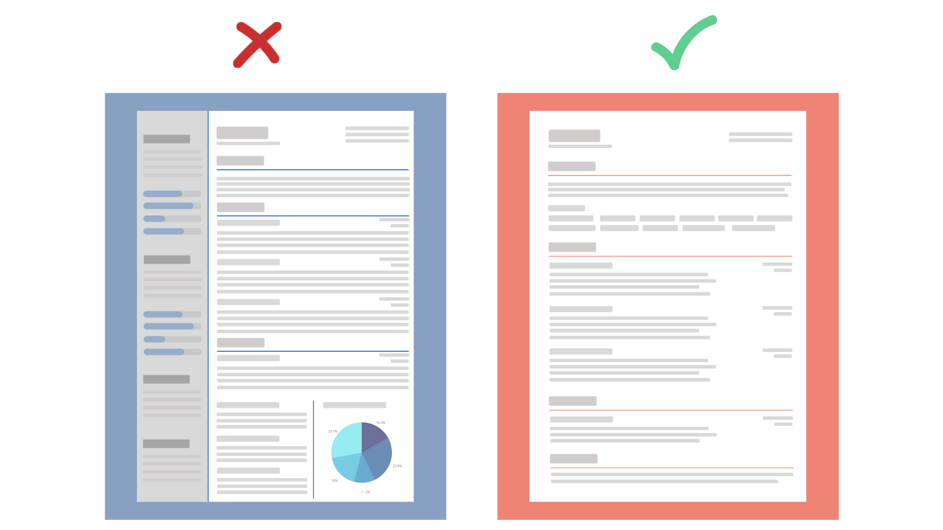
The best strategy is to keep it simple. Use clean formatting, a readable font and make sure it has a nice balance between text and whitespace.
Formatting and Fonts
Try to avoid special character bullet points, tables, or other complex formatting. Especially if you plan to upload your resume to a job board or send it to a company that uses an ATS system. Such systems typically break the formatting, making it look weird and difficult to read.
If you are applying to a smaller company or are sending your resume directly to a hiring manager, you can feel more confident making it more unique or adding some flair.
The font and formatting you choose should be consistent. It’s best if you avoid writing your resume in Times New Roman. Use a modern, sans serif font that’s easy to read. Something like Arial, Calibri or Helvetica is always a good choice.
Make sure you use enough whitespace. If a resume looks too crowded it will be much harder to skim through. You don’t want to hit the reader with a wall of text!
When saving your resume, PDF is the safest bet. It can be universally opened and the formatting will generally look the same everywhere. The only negative is that resume parsers often struggle to read PDFs, especially if they have any special characters in them. So yes to PDF, but avoid special characters and tables.
Colour
Colour-wise, you can use a very subtle colour scheme that complements and highlights the most important sections of your resume. Just don’t overdo it!
Length
Finally, no one has time to read an eight-page long document. Good for you for having so many life achievements, but try adding only the most important and relevant information. A one to two-page long resume is the perfect option.
Resume Structure
For a well-structured resume, you want to start with your personal details at the top, followed by a brief summary of your experience, motivation and professional interests. Adding a list of your most important technical skills on the first page is also a good idea. You then want to include details about your work experience, education and finish with any other additional information about yourself like hobbies, interest outside of work or references.
Personal details
The personal details section sits at the top of your resume and should include your name and surname, email address and hyperlinks to your personal pages, such as your blog, GitHub, LinkedIn, etc.
It is very important to double-check your hyperlinks, you don’t want to start your resume with a faulty link.
There is no right or wrong regarding adding a photo to your resume. If you feel like a photo of you will better showcase your personality (or you’re just really cute), you can put it up, there’s nothing wrong with that. But if you don’t want your picture up there it’s fine not to add it.
Summary
A summary is a short, to the point description of who you are, what you’ve done and what you are looking for or seeking from the new role.
The opening sentence of your summary is one of the most important things you say in your resume, as it will probably be the first thing the hiring manager reads. The purpose of that sentence is to help them find the exact candidate they are looking for.
You should leave out any hyperbolic language or filler words. We all know you’re a “hard-working, disciplined, natural born leader who’s also a good team player”, we just want to make those assumptions ourselves.
Talk about your past experience, your motivations and your professional interests. When reading your summary the hiring manager should get a first understanding of who you are as a person and why you will be a good candidate for their position.
Skills
Adding a list of skills at the top of the resume is a good idea. You want this section to be the core descriptor of yourself. Just remember to focus on your core skills. You don’t need to mention every technology on earth, less is always more.
You should add in what makes you stand out, what differentiates you from other candidates.
You get some extra marks for differentiating between which skills you have commercial experience with and which ones are self-taught or used in personal projects.
One more thing to consider is that most people going through resumes are not technical, so putting a bunch of complex technologies just to show off doesn't matter to them. They want to see technical skills that are relevant for the job.
Experience
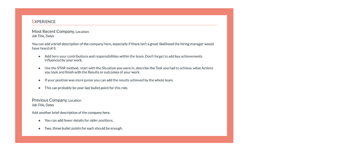
Your work experience should be concise and easy to read, with the most recent experiences described first.
Each work section should have a brief introduction and description of the company, your role in it, followed by bullet points with your contribution/responsibilities within the team and key achievements. You could also add links to the company website or the project you worked on.
As you work backwards you can be less detailed for older positions.
For describing your contribution, using the STAR method is good practice. You start with the Situation you were in, describe the Task you had to achieve, what Actions you took and finish with the Results or outcomes of your work.
Not everyone can be the star team member, but if you were and your contribution was valuable, don’t undersell yourself. Always mention the impact your work had on the final results of the project.
Education
I’m sure you’ve heard people say “these days, education doesn’t matter that much”.
To be honest, it’s usually the ones that don't have any.
The truth is, although work experience might be more important, a great school will impress hiring managers.
Especially true if you’re just starting out and don’t have a lot of experience to show off.
List your education from the last to the first. Mention the course, date, location and GPA if relevant (i.e. if you’re not ashamed of it).
Adding any achievements related to your education will make it stand out even more. Again, make sure you’re adding details relevant to the job you’re applying for.
Other sections
Adding additional information to your resume is what helps you stand out from the crowd.
Personal projects, volunteering, testimonials, awards, are things that make you interesting.
It also really helps if you have limited work experience. Make sure to link to your projects, allowing the hiring manager to see it for themselves.
This is also the place to show flair and personality.
However, only list your hobbies if they don’t make you look basic. We all love to travel and read. Maybe think of something more unique to you.
Another big "no no" are hobbies that might have a negative connotation. Best practice - use common sense.
Takeaways and things to remember
Some things to keep in mind when writing your resume are:
- Don’t overcomplicate it. If reading your resume is like solving a crossword, the hiring manager won’t take the time to solve it. Don’t overuse visualizations, complicated layouts or structures. Don’t make it a task to understand your skills or who you are.
- If you’re just starting out and don’t have enough experience, focus more on your education and personal projects, open-source contributions, etc.
- This goes without saying but always proofread your resume!
- Treat your resume as an advertisement for you. The hiring manager needs to spend 15 seconds at most to get an idea of the most important things about you.
- It should go into enough depth to cover what you’ve worked on and accomplished but it should also be broad enough to be appealing for the job.
Finally, remember it’s not what you say, it’s what other people hear.
You’re not writing the resume for you, it’s not a biography of your life. Ultimately, no one cares how amazing you are and how many cool things you’ve done, they are looking for a certain candidate for their needs and they want to see that in your resume. You’re trying to get a job at their company, so you need to tell them what they want to hear.
Good luck!
Template Example
Here’s a resume template you can download and use: click here to get the template.
WorksHub
Jobs
Locations
Articles
Ground Floor, Verse Building, 18 Brunswick Place, London, N1 6DZ
108 E 16th Street, New York, NY 10003
Subscribe to our newsletter
Join over 111,000 others and get access to exclusive content, job opportunities and more!


